Why UX in Ecommerce is important?
UX is important in e-commerce since it guarantees that your clients can effortlessly explore your website, locate what they need and buy it. If you make it simple for consumers to buy from you, they will be more satisfied and probably come back.
List of 10 Best UX ecommerce websites
More and more companies on the market are trying to provide the best user experience in e-commerce.
List of examples:
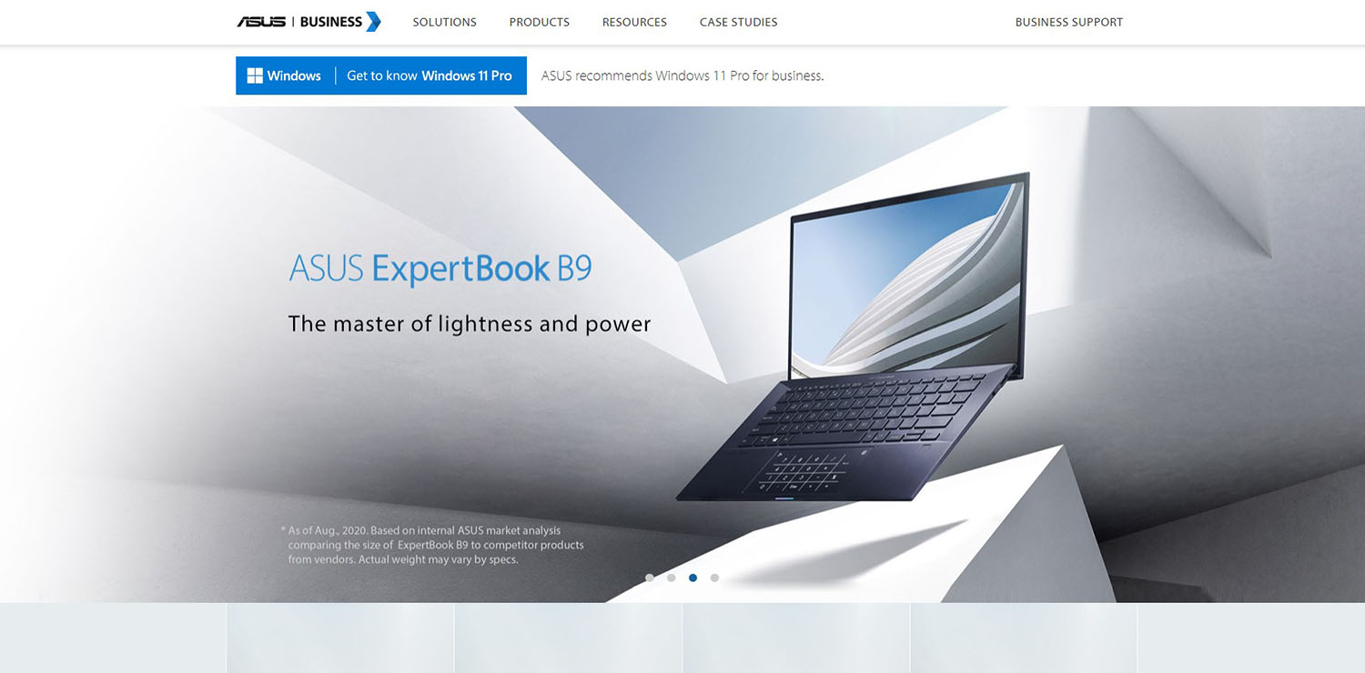
Asus
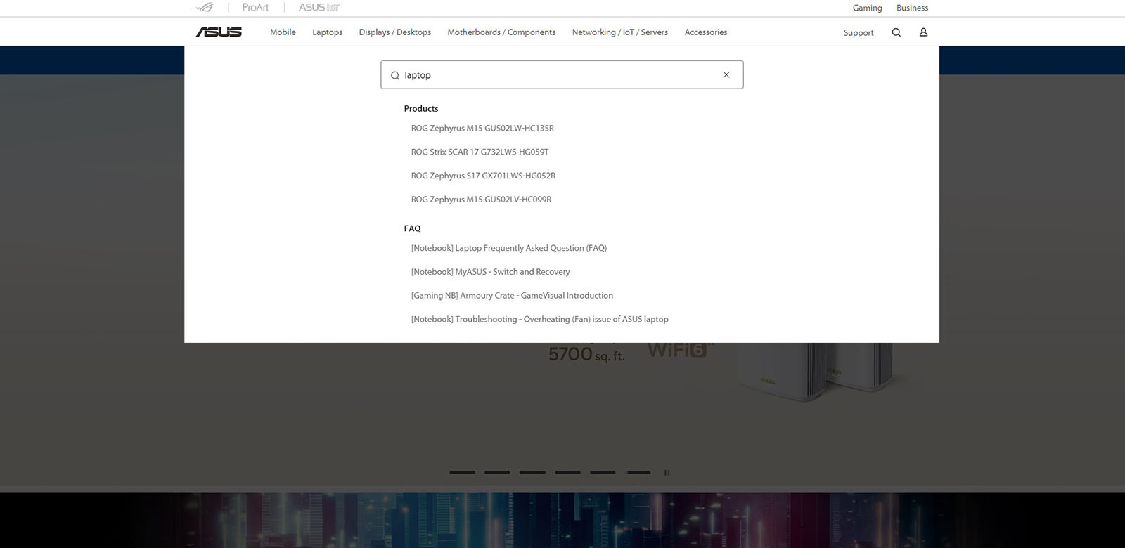
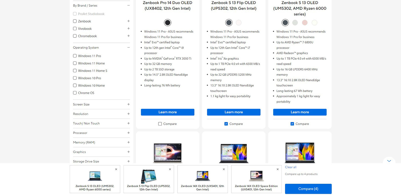
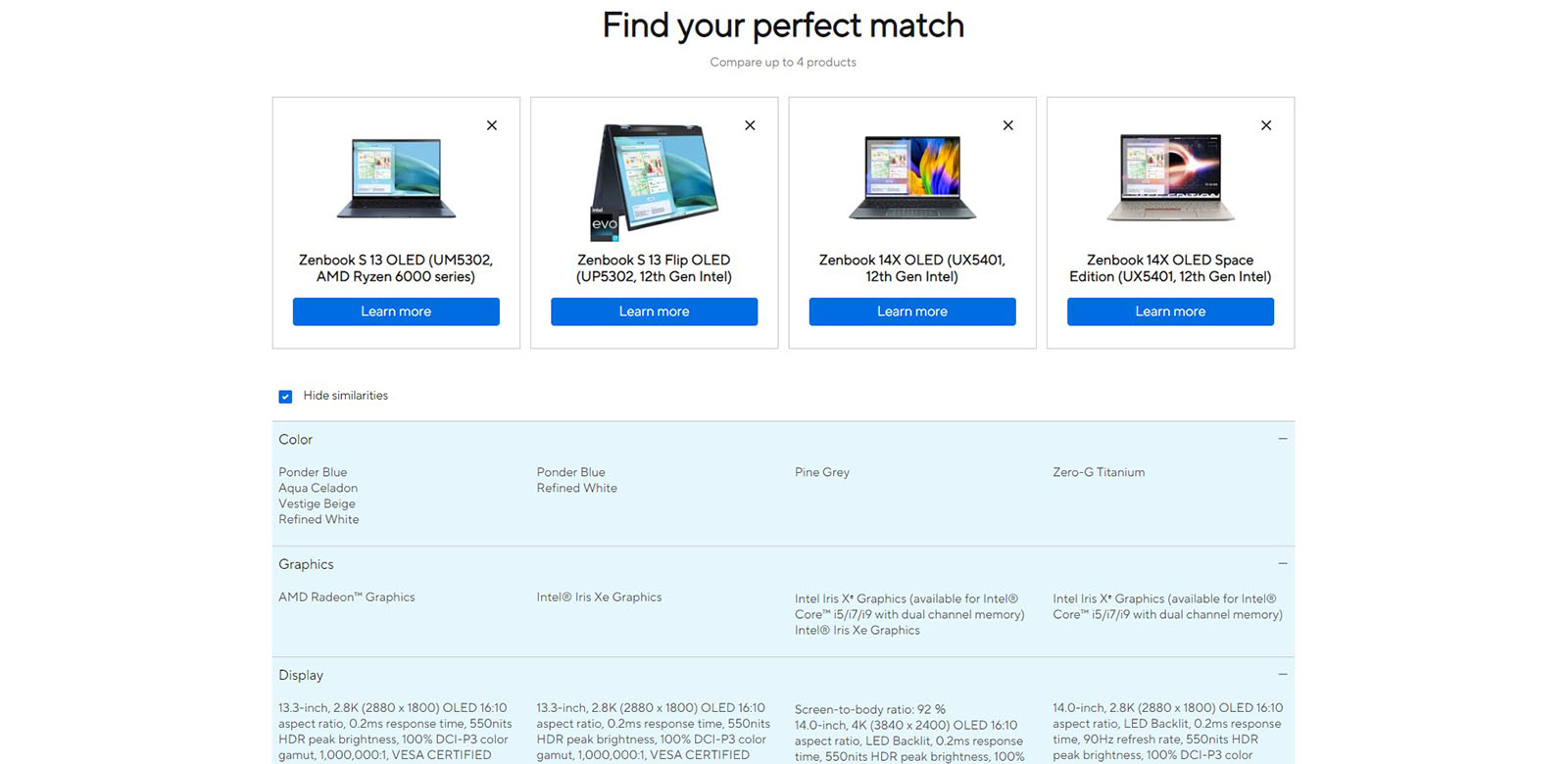
Asus e-commerce stands out from the crowd with many good UX practices. First of all, it has an excellent division into categories that contain appropriate subcategories and a division into brands. They also put a special emphasis on the search engine, which has automatic suggestions for products and topics from the FAQ. The Asus shop leverages the Magento platform to run both a b2b and a b2c store concurrently. It allows business users to switch between platforms easily.
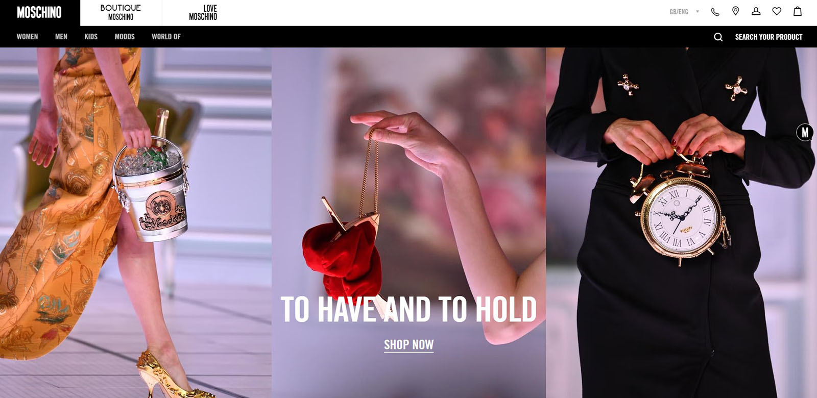
Moschino
Source: www.moschino.com
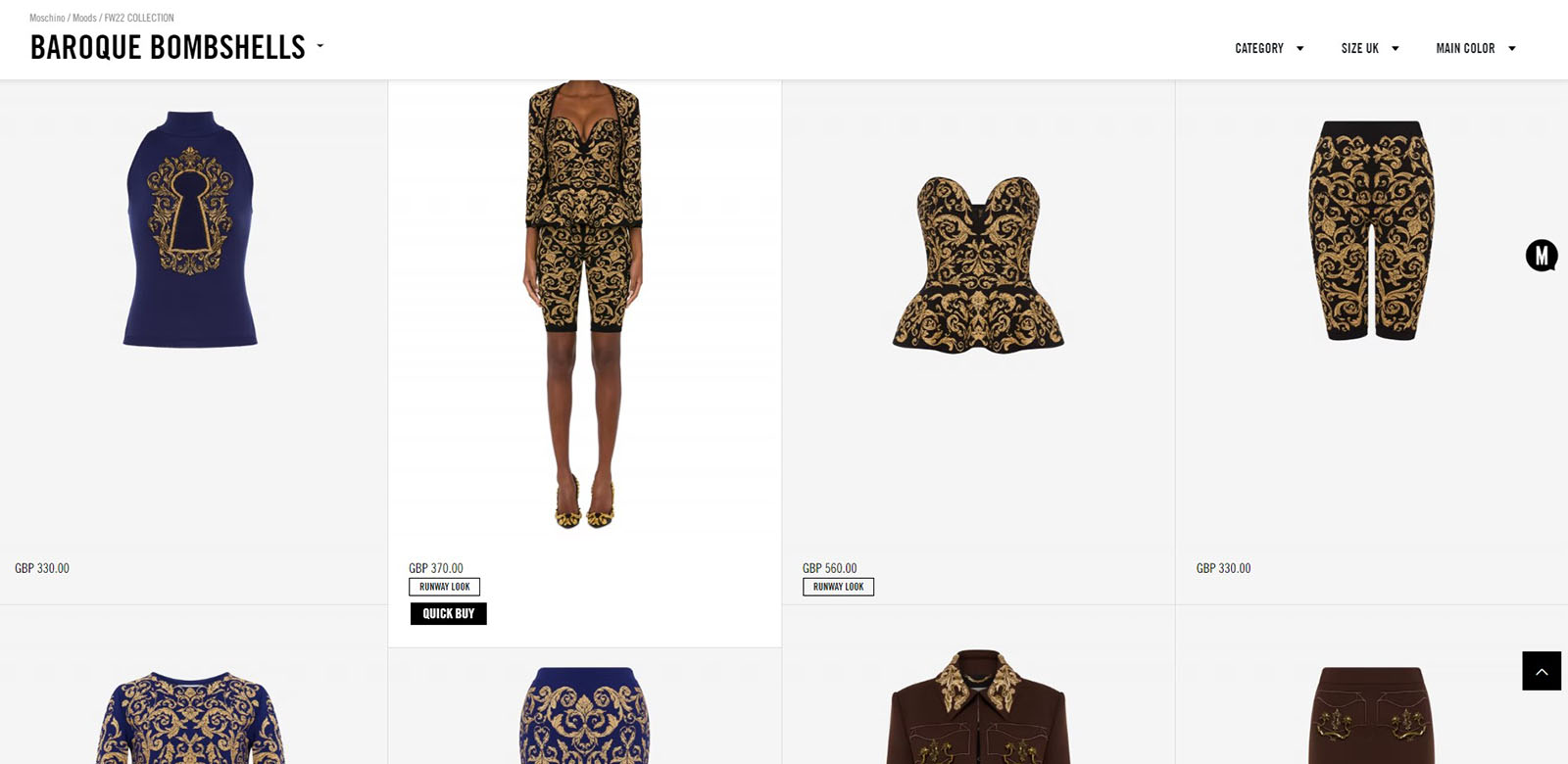
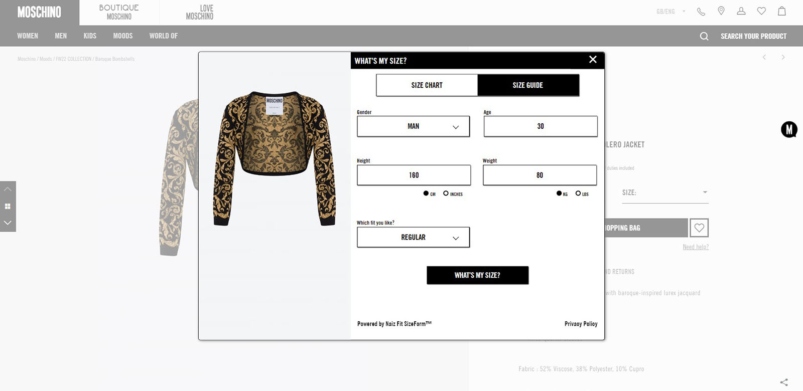
The Moschino store uses Magento. It has a simple navigation. The search engine, which shows product tiles as hints, deserves special attention. Thanks to this, from the level of the search engine, you can buy the product you are interested in using Quick Buy. In addition, the search engine has built-in filtration, so you can immediately narrow down your search for products. Additionally, the product page contains a tool for the user: “what’s my size?”. It helps users to order the proper size.
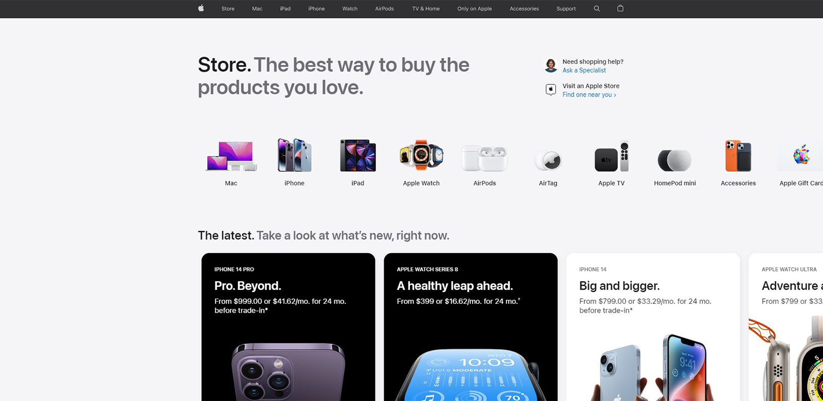
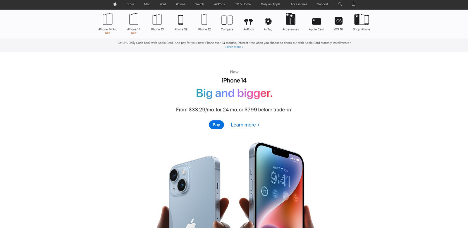
Apple
Apple focuses on minimalism in the design of products and in its store. Their navigation is simple and clean, submenu in the category has nice icons representing products. The page is divided into store and product information pages from which you can easily go to purchase of the product.
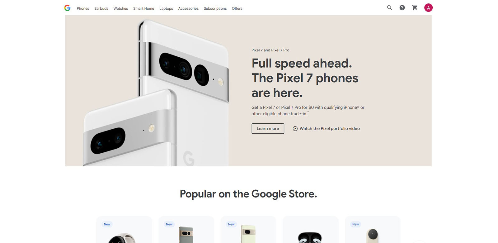
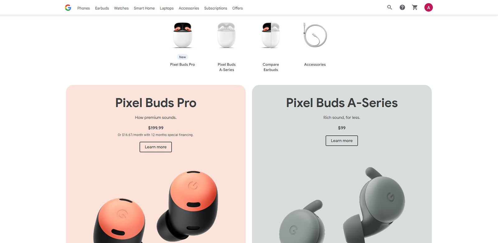
Google store
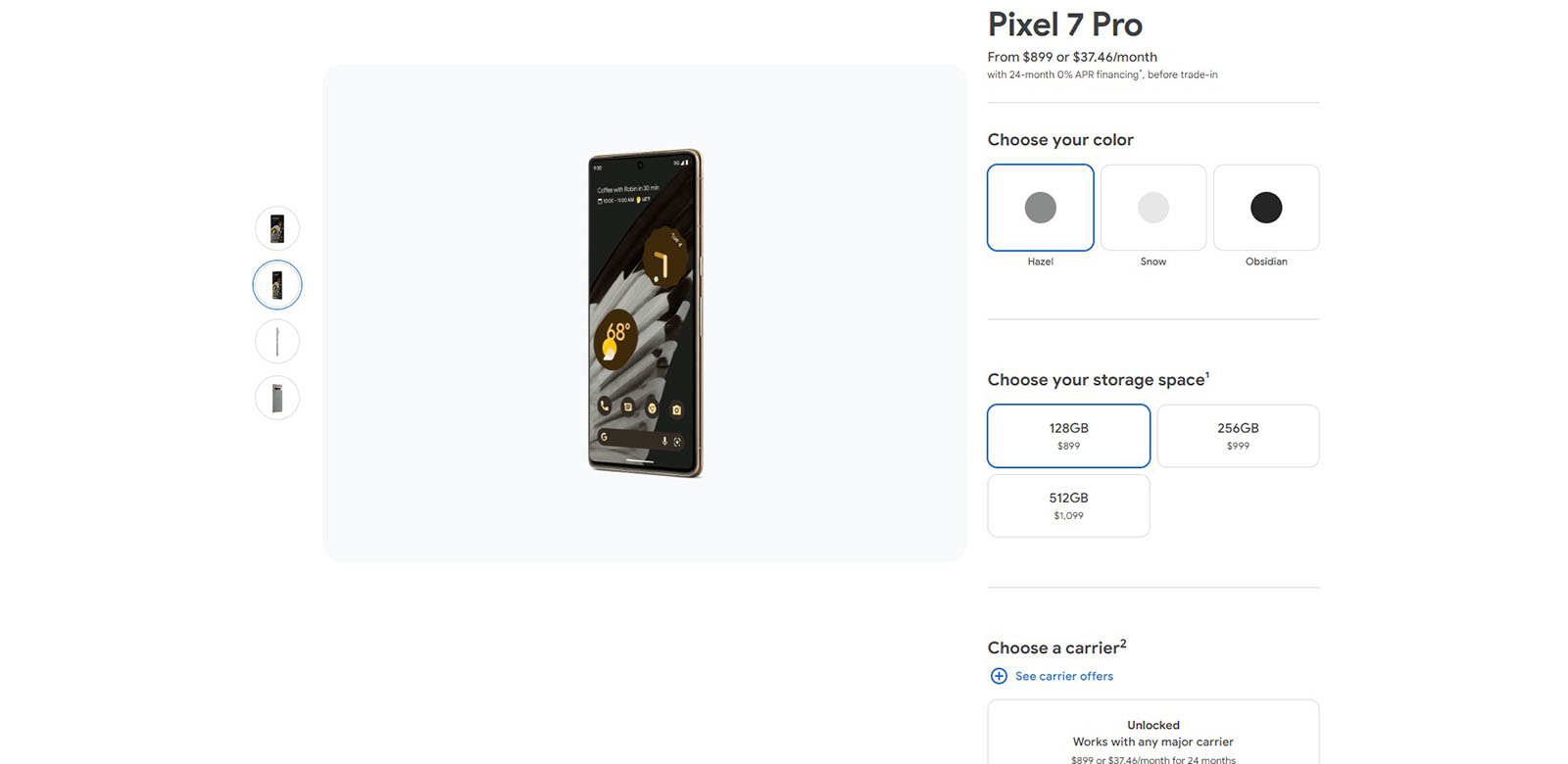
Like Apple, the Google store focuses on simplicity and clarity. The navigation is divided into main categories and then into product series.
On the product page, the focus changes to the next area after selecting one of the options. During the purchase, we have the option of a one-time or subscription payment.
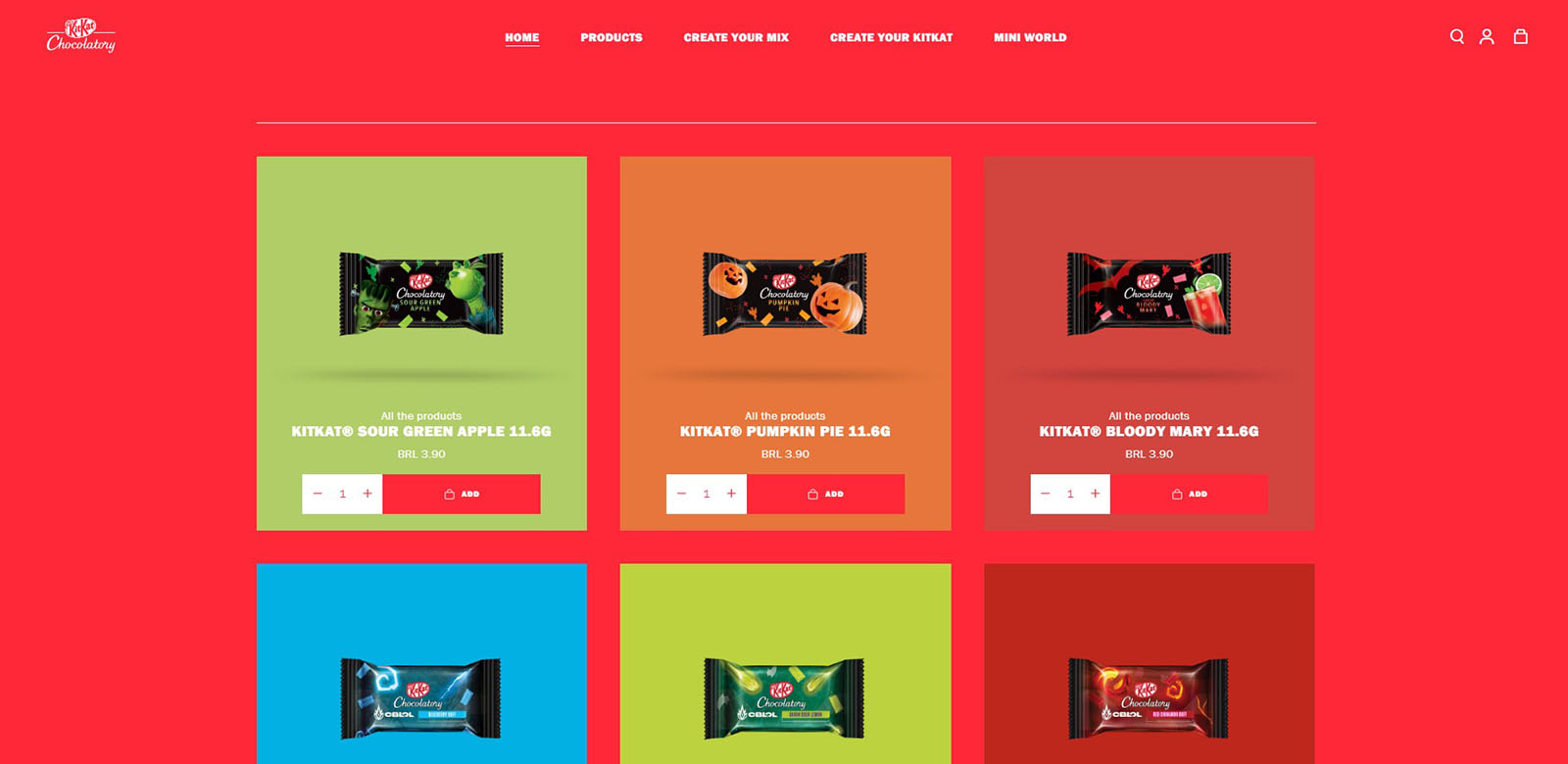
KitKat – Brasil
Source: www.kitkatchocolatory.com.br
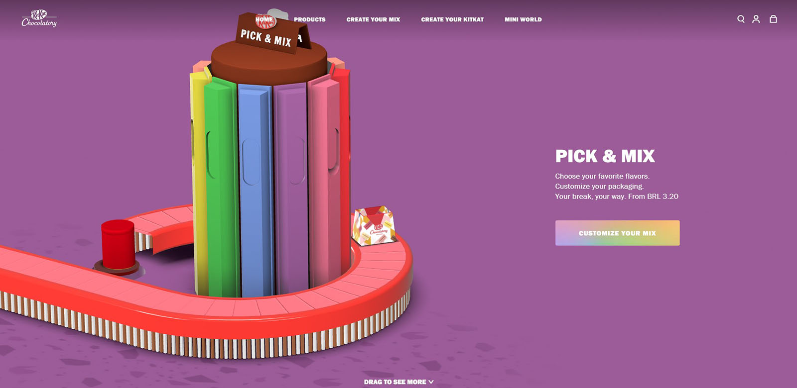
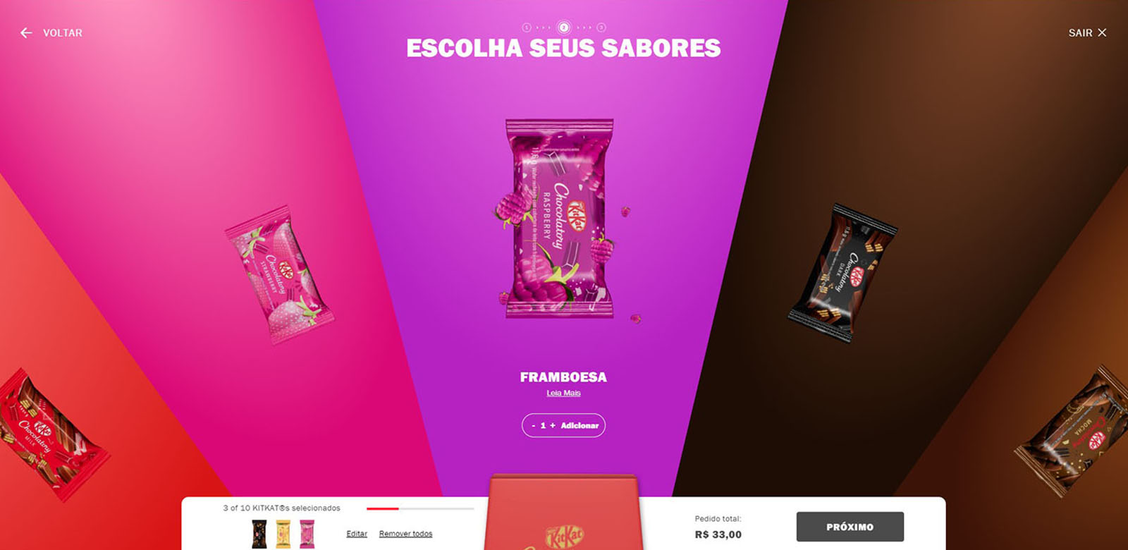
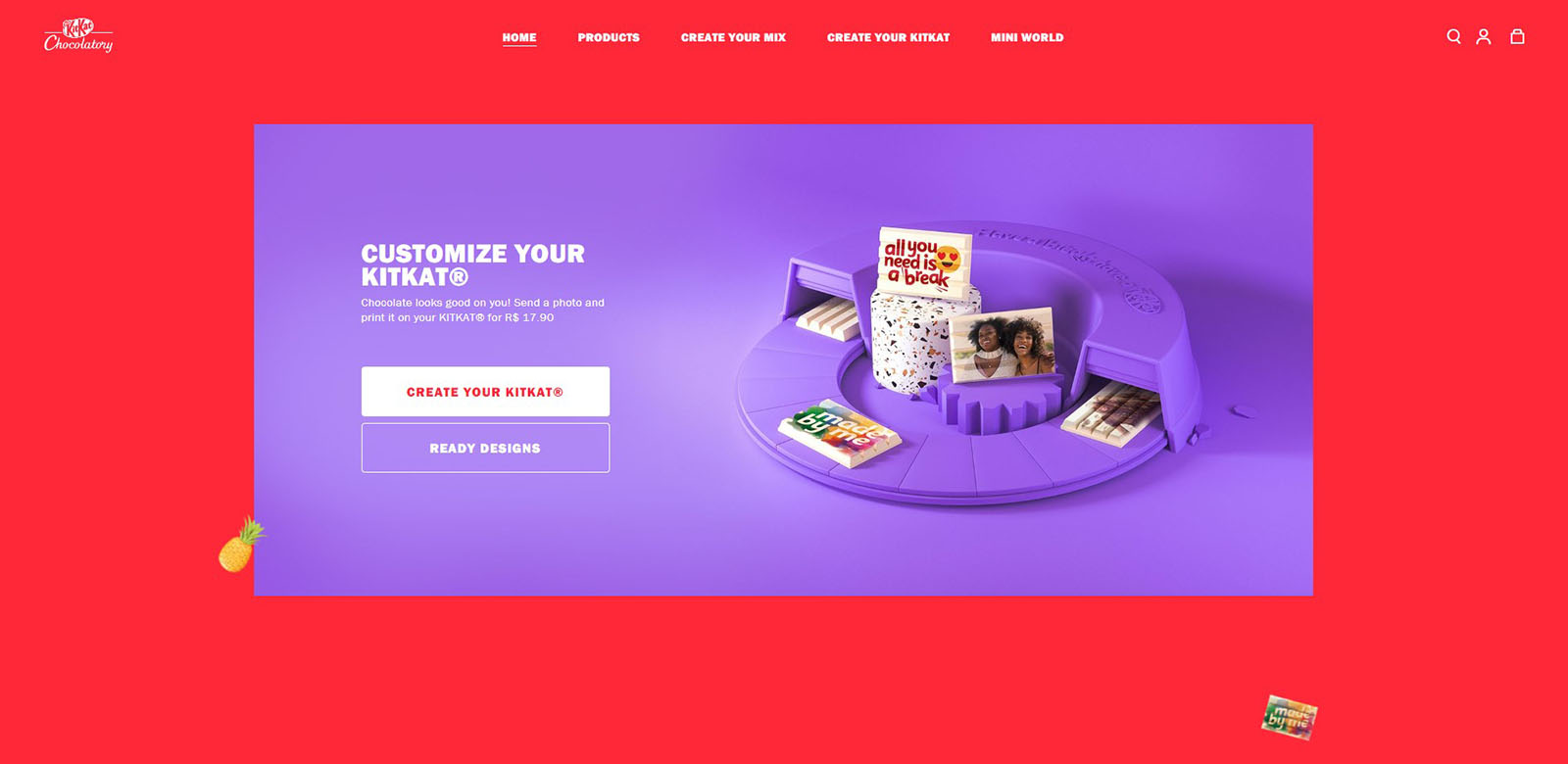
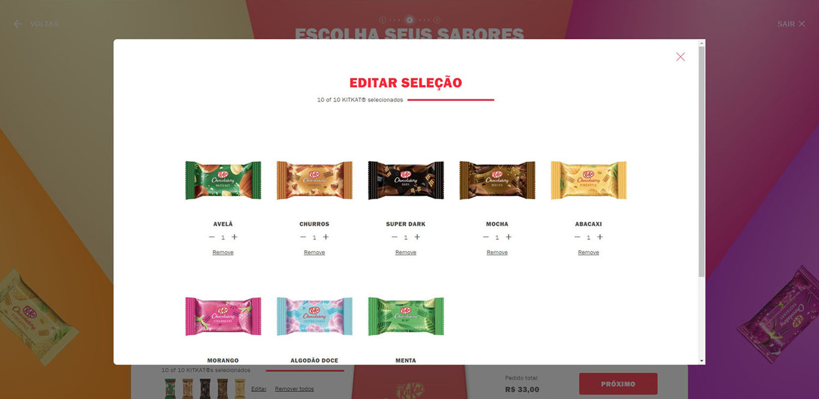
Kitkat’s website, despite the unusual visual effect, is still fully functional. It focuses on personalizing purchases in a convenient way for the user. The customer can buy products traditionally by selecting individual products in special sets or fully customizable products.
Besides, editing the summary at the checkout doesn’t require going back to the previous pages. They also create a gamification system and a loyalty program: Break Society. The website takes full advantage of Magento’s potential to build a good user experience.
Crutchfield
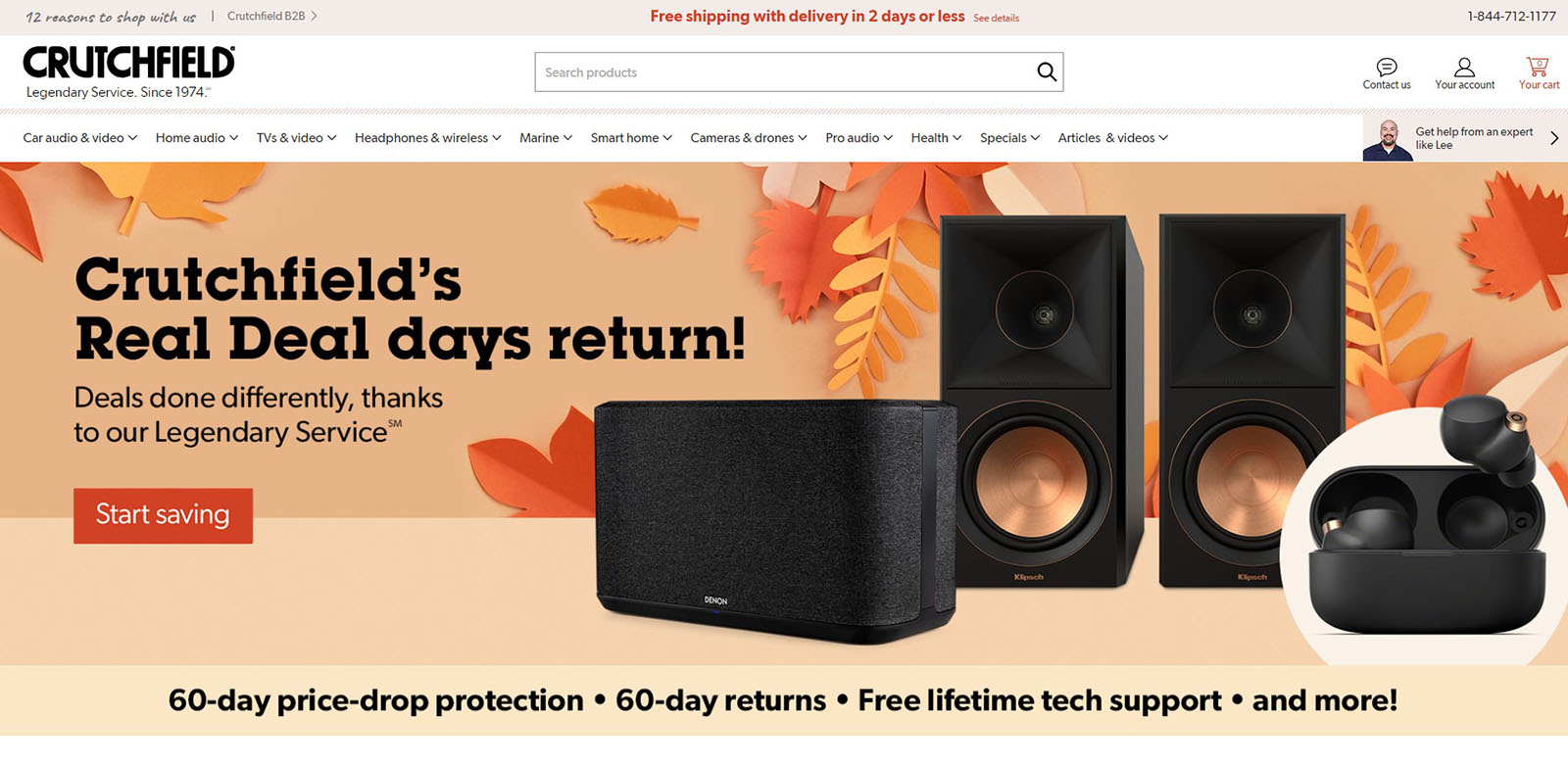
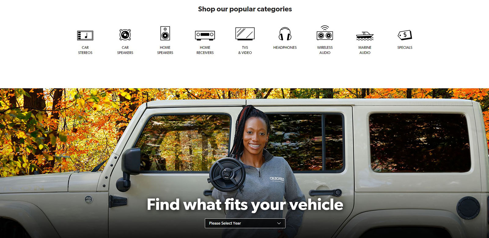
Crutchfield mainly offers electronic audio equipment. The home page is excellent. The user can easily find out about the return policy and popular categories. Due to the fact that products are often bought for cars, the store allows you to check the compatibility of the car with audio equipment. Each product additionally includes the possibility of leaving opinions by customers.
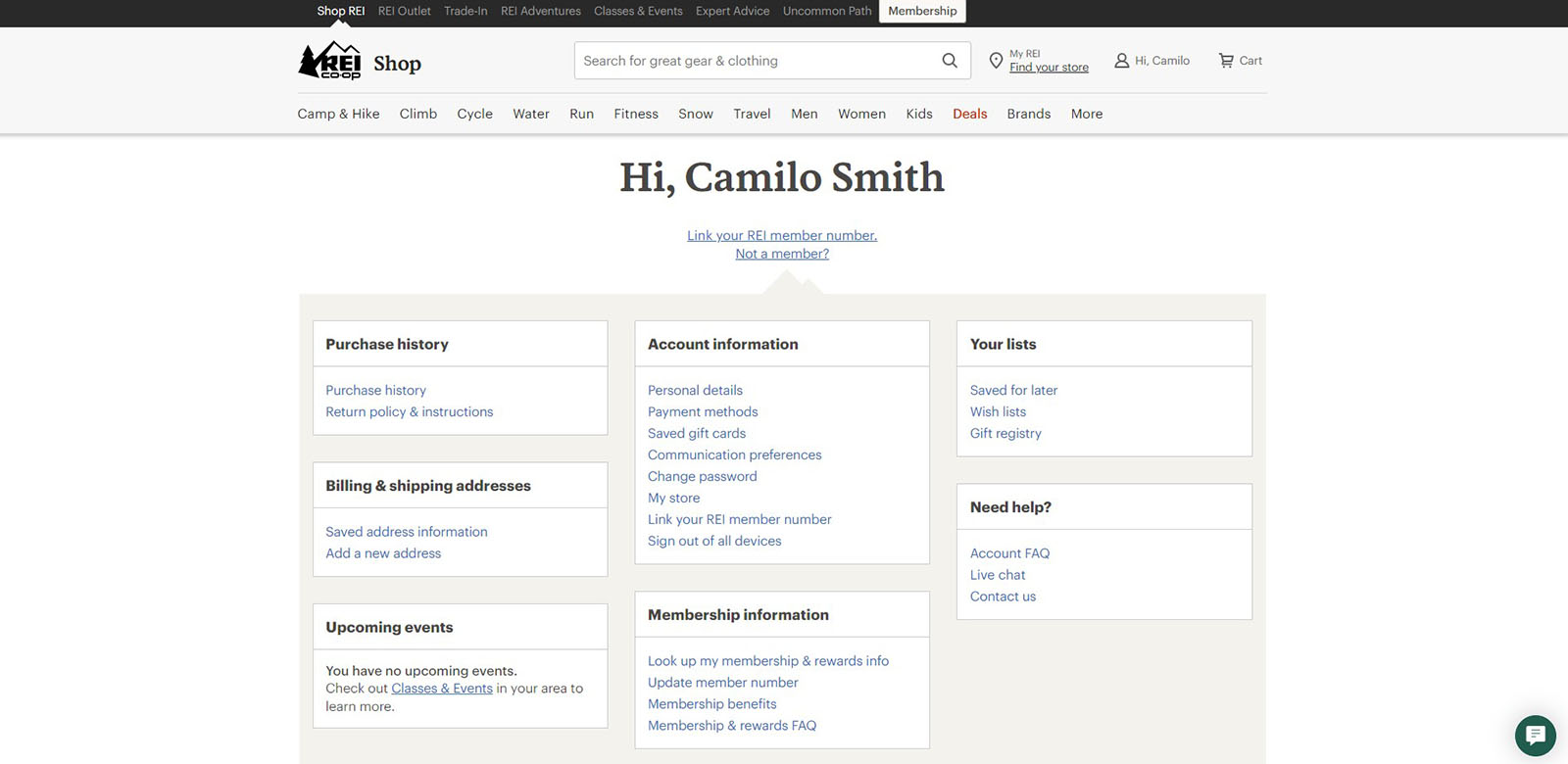
REI
REI is a sports and camping equipment store. In addition to the great division into categories, the store paid a lot of attention to the user panel. The panel makes it easy to reach: account information, Purchase history, Wish list, FAQ and many more. The store also has the option to compare products (up to 4 items at a time), thanks to which customers can consciously choose the appropriate product.
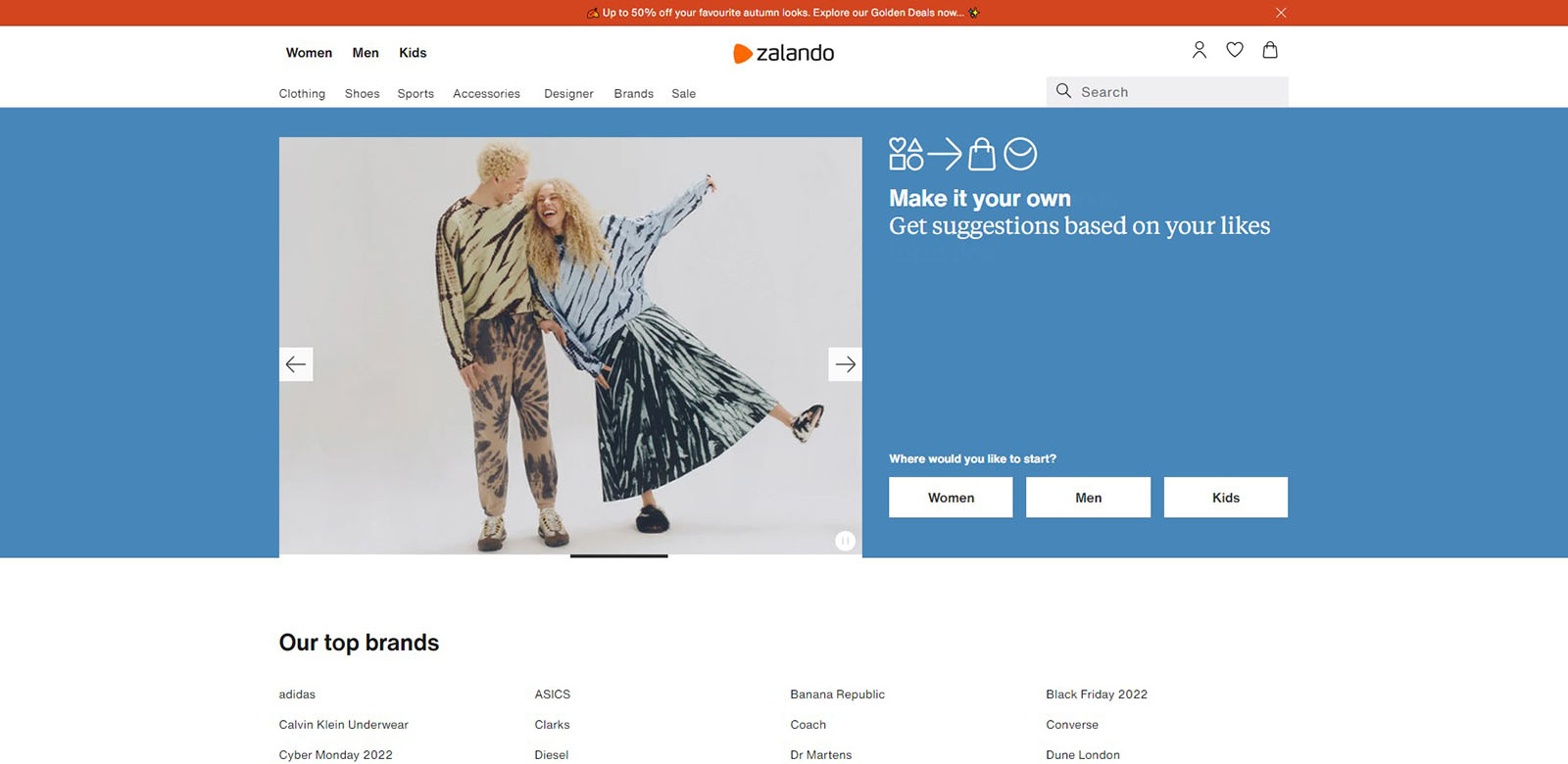
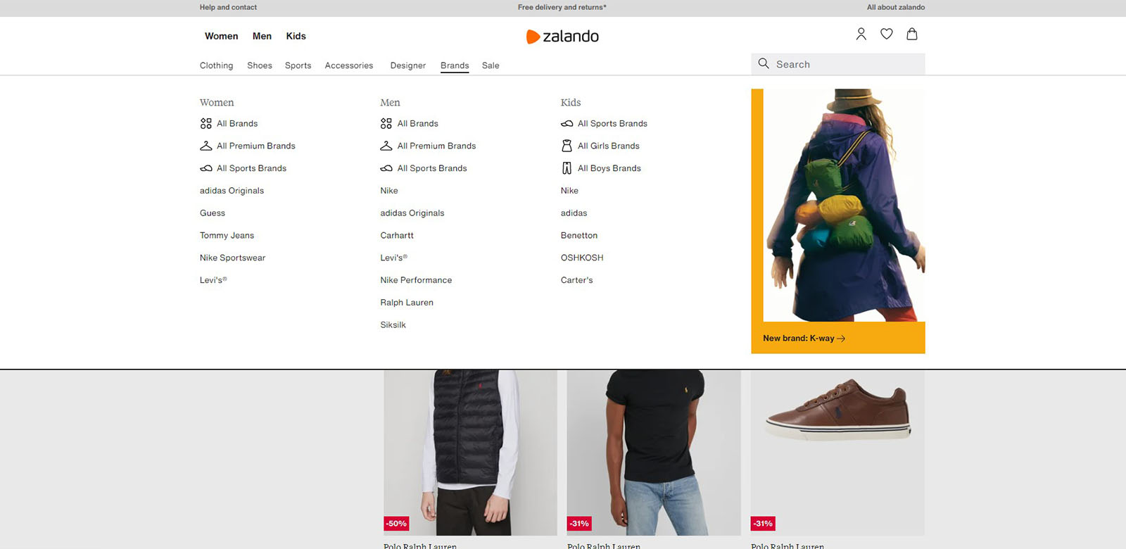
Zalando
Zalando is a world-famous fashion marketplace. They took care to good navigation through the categories well and extensive filtration (choice of colour, material, fit, length, brand, etc.), which allows you to search for the right product. The product page features vital information for the customer, such as the return policy and shipping time. Additionally, you can check the reviews of previous buyers. The only drawback, in our opinion, is that you cannot buy as a guest, but it is standard practice on marketplace platforms.
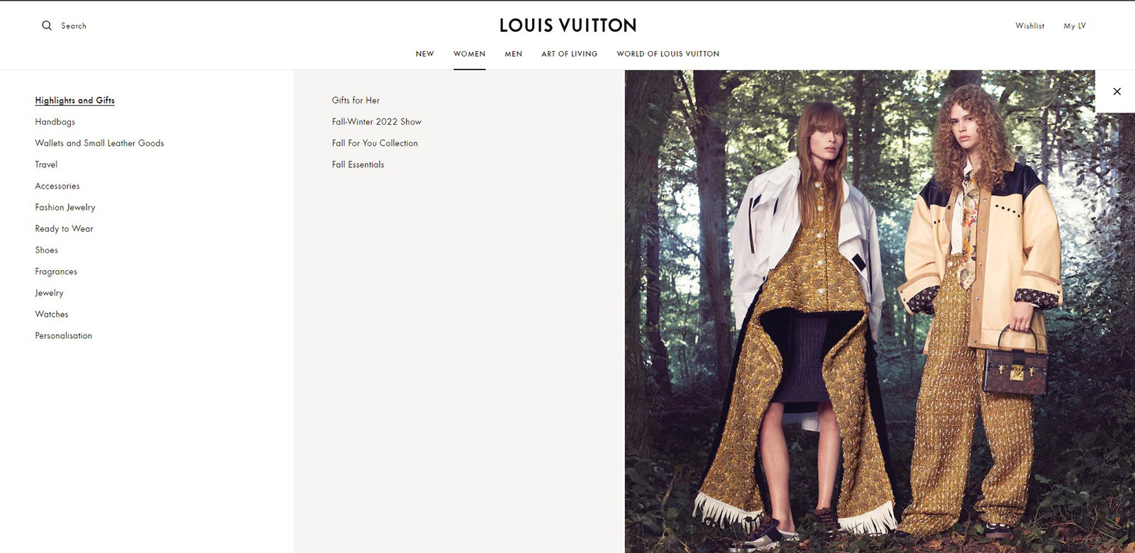
Louis Vuitton
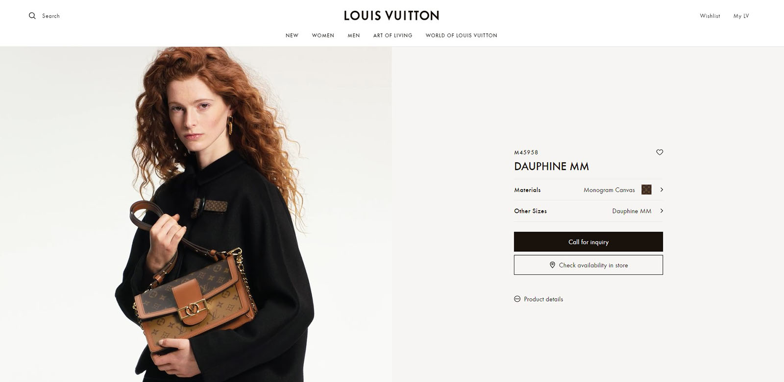
The Louis Vuitton shop is a simple, minimalistic, but expressive high-fashion website. The site’s navigation is intuitive. When you put the phrase, the search engine provides the most relevant products and categories.
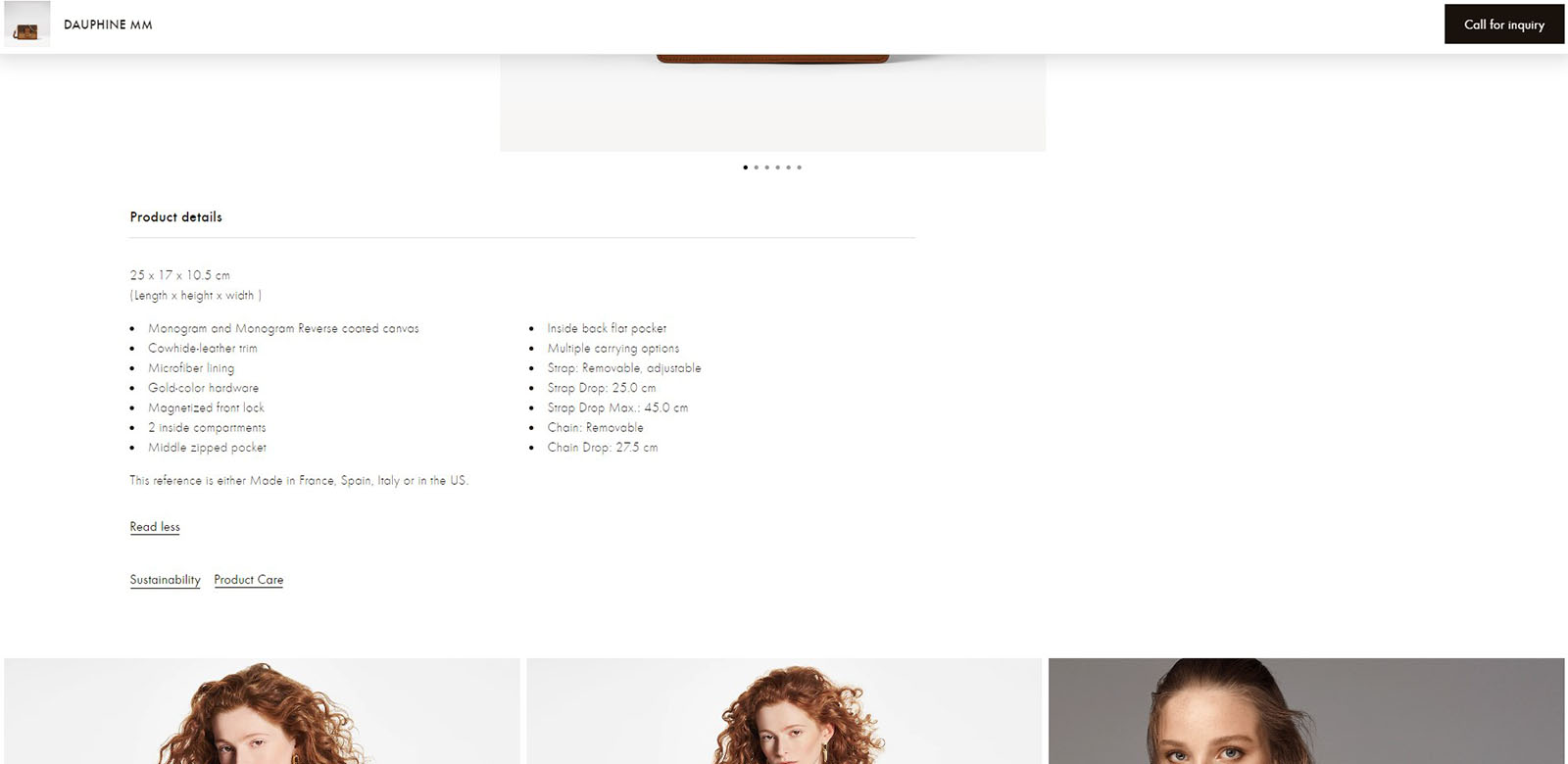
Furthermore, the product page is transparent, yet it just displays the most crucial information for the client.
Nespresso
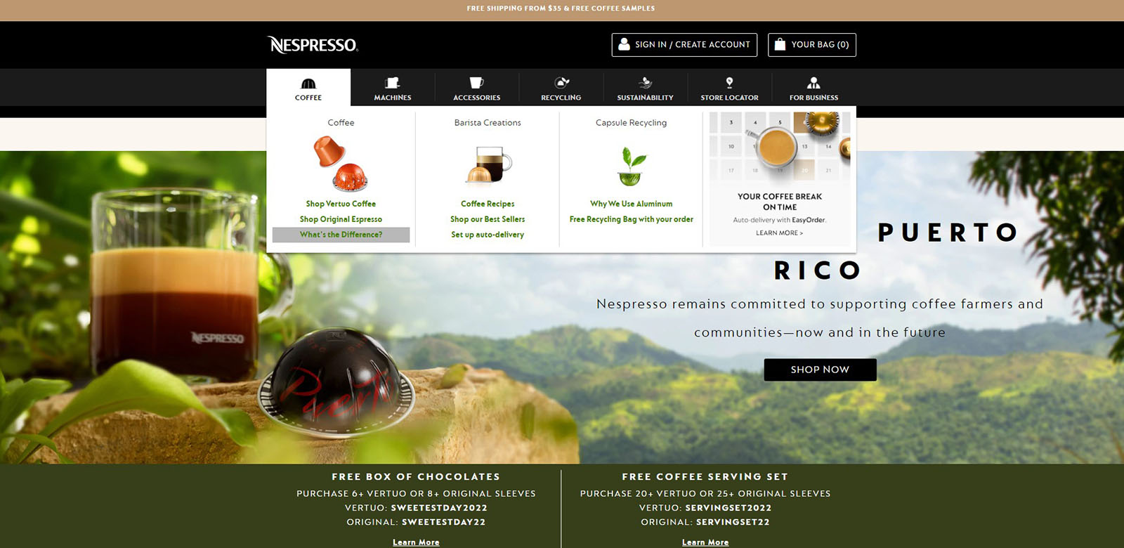
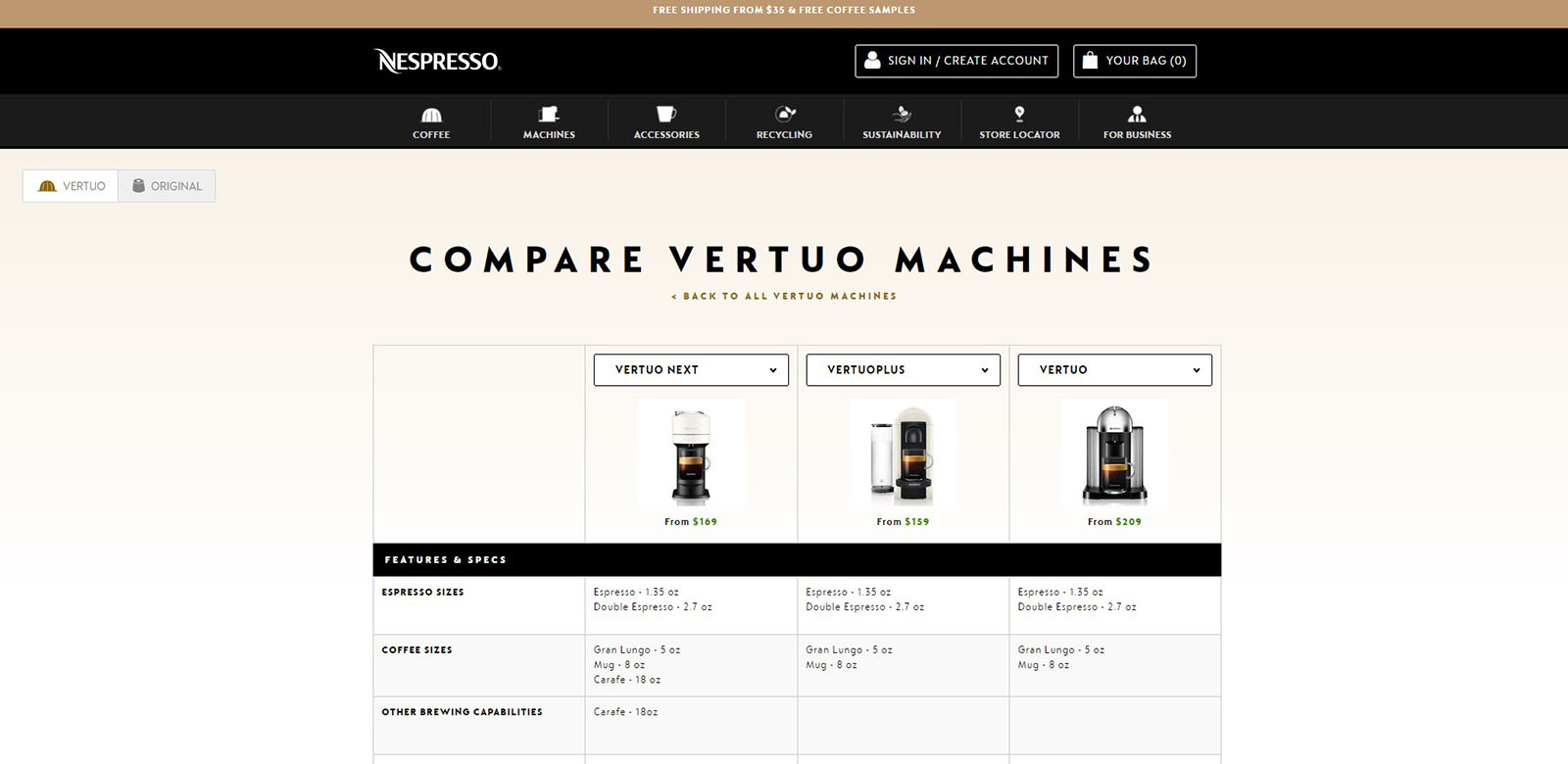
Nespresso store ensures clear messages for the customer. In categories, we can also find subpages with information about product differences.
Thanks to Magento, Nespresso runs many stores in one. The system by user IP opens the appropriate version for the location. As a result, the customer displays the assortment available in his region. Products from the Machines category, due to their more technical specificity, have also the option to compare products.
Best UX eCommerce websites
UX performance – Baymard report
Baymard’s research includes 185 E-Commerce Sites Ranked by User Experience Performance. It summarizes 50,000+ UX performance ratings. Each site has been manually rated across 700+ different UX elements.
From our list, 5 stores were included in the report: Apple, Louis Vuitton, Crutchfield, Rei and Zalando. Each of them received an overall grade of at least decent.
According to Baymard: the perfect home page on desktop and mobile has Crutchfield.
Apple in the indicator: main navigation and order returns received a perfect score.
Louis Vuitton overall has a perfect product page (both on mobile and desktop), but the On-site search needs improvement.
REI is distinguished in the user account category with the Perfect account dashboard. Payment flows and methods on any devices were also assessed as perfect.
Want to start a project?
B4SPOT team will be excited to take your ideas into action. Please contact us right away to discuss your journey.
