What does UX-Friendly actually mean?
UX stands for User Experience. It concerns the user experience at a particular point of contact, like an online store. The goal of user experience (UX) design is to make the customer’s experience pleasant and seamless throughout the purchase process.
Good UX in a broader perspective contributes to good CX (Customer Experience), i.e. the overall perception of the brand by customers.
While discussing UX design, We frequently hear about UI (User Interface), which is focused on the visual aspect of website and application design. UX design focuses on composition and interactions.
So, the phrase “UX-friendly” denotes that the shop was created with the goal of providing a satisfying shopping experience.
Why should you care about UX in eCommerce?
You can run fantastic marketing campaigns, have well-planned sales processes, and have a good product offer, but if you don’t take care of a good customer experience in an online store you waste potential. A customer, encouraged by a great advertisement, will abandon the purchase if he cannot find “the size selection” or go to his “shopping cart”. Even though the first interactions with the brand were positive, he will remember the weak UX of the page and the feeling of frustration when trying to buy.
Therefore, the purchasing process must go as smoothly as possible. The interface should be functional, aesthetic, and tailored to customers’ habits and needs.
How to take care of a good UX eCommerce?
The best option before implementing the store is to conduct detailed research on your recipients’ habits and needs. However, there are several universal practices used in UX design.
Good first impression
Like in real life, first impressions matter because you may not have the next opportunity to change this opinion. Because of this, the Home page should catch the eye but be clear and redirected to the most crucial sections. Take care of CTA buttons that engage customers. Remember, don’t overdo it, lest you overwhelm the customer.
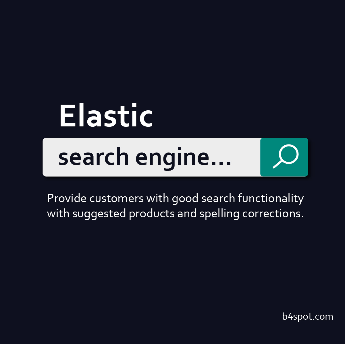
Elastic search engine
Some group customers browse websites looking for something that would interest them, but others know what they need. It is beneficial to provide them with good search functionality.
- Use the well-known search bars.
- While entering the product name, suggest items that contain the entered phrase.
- If nothing matches the search, show recommended or similar products.
- Take care of typos in queries. Suggest correct spelling before or show the closest results after search and inform a customer about spelling improvement.
Speed up your store
53% of visits are abandoned if a mobile site takes longer than 3 seconds to load. (source: thinkwithgoogle.com)
Page loading time affects users’ perception, but also SEO. Clients get annoyed when a web page takes more than a few seconds to load and leave the store. Therefore, optimize the elements that weigh down the page, such as large pictures and complex animations.
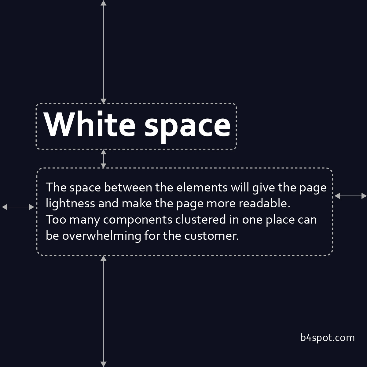
Don’t be afraid of space
Pimp up product page
The product page is the second page on the home page where users most often decide to leave the store. That is why it is crucial to design this page in a transparent manner. It is worth taking care of high-quality photos and detailed but simple descriptions. Purchase buttons should be easy to find. A product’s properly prepared technical specifications will aid in maintaining a clean appearance on the product page. Technical paraments can also use in filtration in the search engine.
You can also add many other elements that build a positive customer impression. Product reviews, the possibility of comparing products or a virtual fitting room allows the customer to get to know the product better and have more confidence before buying it online. But try to keep it simple. Design any extra features carefully to avoid making them redundant or ineffective.
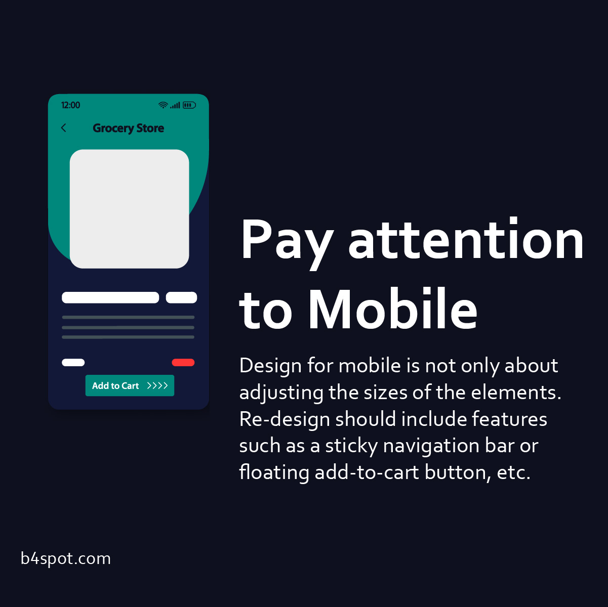
Pay attention to Mobile
Currently, 67% of users do their shopping over mobile devices (source: statista.com). That’s why it is so important to adjust the online shop layout. It’s not only about adjusting the sizes of the elements but also ensuring a pleasant flow. It is worth implementing such functionalities as a sticky navigation bar, floating add-to-cart button, pinch and zoom for photos and click to scroll. All these little details make your UX-friendly eCommerce for mobile users.
Seamless ordering, clear checkout
Take care of a transparent, UX-friendly purchasing process. Don’t force users to create an account to complete the purchase. Building a customer base is fundamental, but by forcing registrations you can put customers off. Offer to create an account, but allow the user to purchase as a guest. You can also create an account after placing an order.
The purchasing process should be simple and not misleading. Use clear layouts, divide information into blocks, use a summary of purchases and remove distractions surrounding the checkout.
Don’t require providing data that is not necessary to complete the order. Unnecessary data lengthens the ordering time and may result in a lack of confidence in their processing.
Research shows that in most cases, One-step checkout is a better solution, but a well-designed Multi-step checkout can be equally transparent to the customer.
Just right number of options
Users don’t like to not have choice. No wonder everyone has different preferences and habits. However, research shows that too much choice is also not good. Overwhelmed customers may choose not to purchase. Choose a few payment gateways that are well-known and reputable in the market where you operate. Additionally, you can provide modern options like instant installments BNPL or digital wallets.
Same with the forms of delivery. Selecting the best courier companies and several delivery options will improve the customer experience more than if they had only one delivery option.
UX-friendly eCommerce
Summary
To have UX-friendly eCommerce, you must constantly take care of the development of the website. Observe and test. Be flexible and avoid being too tied to a solution that won’t work for your customers. The examples provided are basic principles, and remember the widespread need to personalise experiences.
Have any questions in your mind? Use the comment section!
Want to start a project?
B4SPOT team will be excited to take your ideas into action. Please contact us right away to discuss your journey.
