Checkout proccess step is one of the most critical steps of the shopping experience that can break a sale. The customer must get clear information about what he is ordering and what information he must provide to complete the purchasing process. Good UX equals more customer satisfaction.
Over the years of shaping eCommerce, the topic of the shopping cart and checkout design has been approached in different ways. Most often we hear about two of them: one-step checkout and multi-step checkout. What is the difference?
Multi step Checkout Magento 2
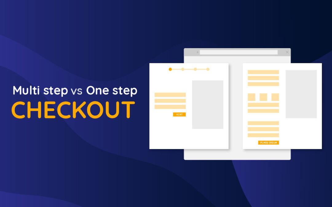
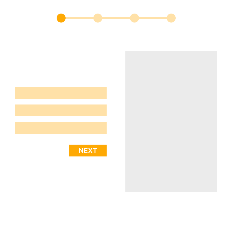
Multi-step checkout (or multi-page) spread out the purchases process into steps on several pages. Most often, the summary, shipping details and billing are 3 to 5 separate steps. But for example in Magento, the default checkout has 2 steps.
One step Checkout Magento 2
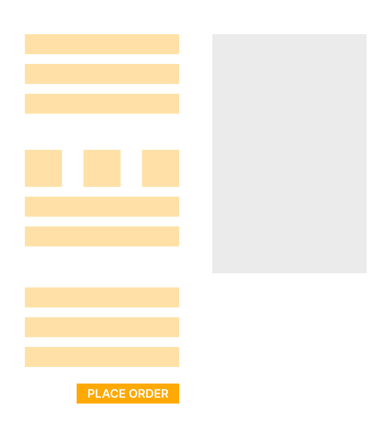
One-step checkout (or one-page checkout) is a method of designing an eCommerce website in which the full checkout process is performed using a form on one page. All elements such as summary, address information, shipping, and payment details are on the same page. The customer also immediately sees the summary of his basket, with a list of products, delivery costs and any discounts.
Good to know: One-click checkout is not the same as One-step checkout, because that solution enables customers to complete a purchase with a single click. This requires most often a customer account and a fully completed profile with billing information. Until 2017 in the USA this solution was protected by a patent and only Amazon could legally use it or give permission to another company.
Pros and cons of Multi step Checkout process
+ User behaviour can be analysed in more detail. This solution allows you to better understand the reasons for abandoning shopping carts. You will find out more precisely what may cause the reduction of conversion. This is useful if you have a large and diverse audience and want to select subgroups for your marketing purposes.
+ Is easier to keep the layout clear especially on mobile. By dividing the process into steps, it is much easier to design an easy-to-read appearance. By choosing a multi-step checkout, you do not have to face the challenges of a long page that the user will have to scroll through.
– Clients can be scared by too many steps. If the purchasing process is broken down into too many steps, it may seem that the process will take too much time. This can reduce conversions because customers are now impatient and each extra click can frustrate them.
– Making corrections requires switching over the page. If the buyer wants to correct incorrect information, he will have to click several times to get to the correct field.
Pros and cons of One step Checkout process
+ Everything at a glance. Buyer can check their product list, shipping method, and auto-fill personal information on one page.
+ Quicker purchase. Fewer steps for the buyer. Customer can fill in the form only using the keyboard, without clicking the mouse, which reduces the time.
+ Statistically higher conversion rates. It’s not a rule, but many research results show that customers prefer one-step checkout. However, before you implement it, consider whether this solution will also suit the target group in your industry.
– The page can be overwhelming. At first glance, customers may be appalled by the amount of information to complete. On mobile devices, buyers have to scroll endlessly to complete the order. Traffic on mobile devices usually accounts for more than half of the traffic on the store’s website, so it is worth creating a well-thought-out layout.
– Slow Site Speed. It’s not a rule but because of the volume of content to load the time responding website can increase. Using this solution you should pay more attention to good optimization.
– Behavioural analytics are limited. Everything is in one place and therefore you cannot investigate the details that cause the cart abandonment.
What does it look like from the backend? – Magento 2 case study
Information on the single-page checkout is loaded by API which receives information from the backend. Each form field may be independently and send information to the server after the change is made. While the application is still connecting with the backend, it makes use of the data layer and does not require the server to generate all views, only those that change. In a multi-stage checkout, the layout is loaded each time the customer goes to different stages.
One-step checkout is a big development challenge but can be a better UX solution. That’s why we decided to implement a one-page checkout in Vinify.
Which one you should choose? Multi step vs One step Checkout
In most cases, to increase the customer experience, it is worth choosing one-step checkout despite its shortcomings. Choosing this solution involves advanced programming work and costs, but it is more UX friendly. Multi-step is a lower-cost and faster to implement option.
However, due to many factors, it may turn out that best for most is not fit for your store. You should consider whether your store has any specific factors which will make multi-step checkout better. Maybe you have extensive ordering options (e.g. packaging personalization, engraving) that increase the number of fields in the form, or maybe your target buyers have other shopping habits. If you’ve got an extra budget, A/B testing may help decide which option is for you. In this way, you may learn more about your clients’ design preferences by analysing user behaviour and boosting ROI.
Want to start a project?
B4SPOT team will be excited to take your ideas into action. Please contact us right away to discuss your journey.


