A smartphone is currently the most popular device. 75% of respondents use it during online shopping. Right behind it is a laptop- 73% of respondents use it. Other devices scored below 50%. The smartphone wins in the youngest group of respondents, with 92% of responses.

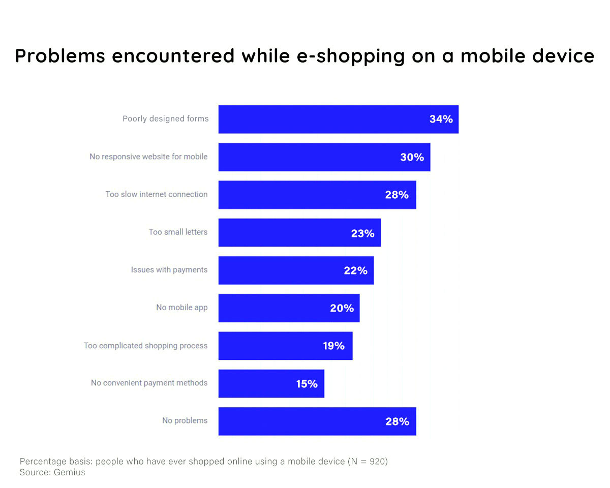
72% of respondents who have ever shopped online using mobile devices have encountered difficulties in this process.
The most difficult problems are the inconvenient filling forms and the mismatch between websites and the devices displaying them. In the context of the growing popularity of shopping via smartphones, this may be an increasingly important problem.
People up to 24 years of age more often mention the problem of “no mobile app” and “too slow internet connection”, while people over 50 have issues with “too small letters”.
How can you handle problems on mobile devices and increase conversions?
Shopping via mobile devices is the most popular form, especially in the youngest group. So it is crucial to provide a positive consumer experience on these devices. Here are some tips on How you can fix common problems:Poorly designed forms
Poorly designed forms – underneath this answer, there may be poorly designed and unclear forms. For example, you put a drop-down list of shipping countries. Customer scroll through a long list to find what they want.
Or your forms have unclear questions, and the user is confused.
Solution: Check how your forms look on mobile devices. Please make sure they are large enough or have hint options. Also, ensure you use simple language and be precise in your questions.
The layout is not responsive to mobile
Too slow internet connection
Too slow internet connection was reported by 28% of the research group in Gemius research. You can suspect that most of the users indicated this option because the page was loading slowly. However, this does not always mean a poor internet connection. Sometimes the website takes up too many resources.
Solution: Of course, you can’t do anything if the user connection is weak, but you can optimize the website well to load faster. It’s extremely significant on mobile devices. You can resize images, utilize caching, and Merge JavaScript and CSS to speed up your website.
Test the Page Speed here: pagespeed.web.dev
Too small letters
Accessibility for everyone is one of the key aspects of good e-commerce. Users differ in terms of their characteristics and needs. Remember that your consumer base may include elderly individuals and persons with visual impairments, for whom page readability is critical.
Solution: Check readability on different devices and make sure it’s okay. Especially make sure the conversion elements are accessible. Consider adjusting your website to Web Content Accessibility (WCAG 2.1.) For example, add the option of manually resizing text.
Issues with payments
Nothing frustrates the user more than being unable to complete the purchase in the last step. Properly functioning payments are crucial in e-commerce. If they don’t work, your shop will lose conversions no matter how amazing the rest of the UX is.
Solution: Provide a proven payment gateway vendor. Perform regular payment method performance tests.
No mobile app
People love apps. They’re convenient, always on the phone, and usually offer more options than regular websites. No wonder many users expect them. That’s why some customers may be put off by the lack of a shop app, specifically if the website performs poorly on smartphones.
Solution: Survey your clients, and check if your clients expect the application. If your budget is tight, think about upgrading the mobile version of the site. Take care of responsivity and optimization. This way, you will provide your customers with a decent alternative.
Too complicated shopping process
According to research, from year to year, people lose the ability to focus on one thing for a long time. Therefore, website and application designers strive to create in such a way that the user does not have to think when using the product. Everything should be natural and friendly to him. Too long and complicated purchasing process may discourage him from buying or brand and, as a result, reduce store conversions.
Solution: Make a UX audit of your website. Check if your website navigation, filtration, product page and checkout are user-friendly. Consider One-step checkout if you are using multi-step checkout. It may turn out to be more efficient in your case.
Read Multi-step vs One-step checkout. What’s better for ecommerce?
No convenient payment methods
Want to start a project?
B4SPOT team will be excited to take your ideas into action. Please contact us right away to discuss your journey.
